Tag: wordpress

  • Is AI Going To Kill WordPress?

    Ask around right now whether AI is going to kill WordPress, and you’ll get wildly different answers depending on who you ask. Somewhere out there is a LinkedIn post you’ve probably already seen, arguing WordPress is basically dead — that nobody in their right mind would start a new site on it today when tools like Lovable, Bolt, and v0 will just build you one from a sentence. It’s a compelling claim. It’s also not the whole story.

    Is WordPress Dying and Is AI the One That Will Kill It

    I’ve spent years writing about WordPress, and lately I’ve spent just as much time working with AI tools — including a fair bit of my own vibe-coding — so this question isn’t academic for me. My answer, if you want it up front: WordPress isn’t dying. What I think is happening is that it’s assimilating AI. Maybe slower than the loudest voices might like, but it’s assimilating it. The way I see it, AI isn’t really a competitor to WordPress — it’s closer to a utility. Like electricity, or like automation before it: something every platform plugs into, not something that replaces any one of them.

    One thing to remember is that saying “WordPress survives” or “WordPress will survive” isn’t the same as “nothing changes.” There’s a real reshuffle coming, with genuinely exciting new products and incumbents nobody was watching two years ago. Even the tools I reach for — Divi AI among them — are part of that reshuffle, not outside of it.

    Three Camps, One Question

    Ask “is AI going to kill WordPress?” and you’ll basically get one of three answers.

    Micahel Sieb says WordPress is toast - quote

    Camp one says yes, outright — why hand-build a site when you can describe one to an AI and skip WordPress entirely. Camp two says we’ve heard this before — page builders, Wix, headless, every “WordPress killer” of the last decade — and WordPress, still powering something like 41.5% of the web, has remained. And camp three says WordPress capitalizes on AI and grows from it, bending with the trend instead of breaking under it.

    Will AI Kill WordPress - Three Camps of Thought

    That’s the easy version of this narrative: one thing dies, another comes out on top. I don’t think it’s wrong, exactly, but I do think it’s woefully incomplete.

    What Vibe-Coding Taught Me About What Actually Lasts

    Here’s where I’ll admit my own bias. The excitement lately has moved hard toward vibe-coded everything — describe what you want, watch an agent build it in front of you. The first time you do this, it’s a genuinely magic feeling. I’ve built a bunch of these myself: small tools, one-off apps, a to-do app or two (we’ve all built one, right?). Some I abandoned. A couple I finished, and no one cared about. That forced an uncomfortable realization: the magic of the generation is not everything you need for something to succeed.

    Once you look at the list of things that actually pair well with AI to make a success story, it becomes obvious that AI is a key piece, but not the whole foundation. Nobody really wants to reinvent the wheel, and even fewer people want to maintain the wheel they just reinvented. Vibe too hard with nothing stable underneath you, and you can vibe a project straight into the ground (I’ve done it).

    Mature products — WordPress, the mass-market page builders, the go-to plugins — are stable ground precisely because they’re mature yet actively developed. We don’t need to reinvent the ground to use today’s newest tools on top of it. We get to stand on the shoulders of a giant while doing genuinely novel things with AI. That’s much less dramatic than “WP dies, and something else replaces it,” but I think it’s the truer story.

    AI Inside WordPress Isn’t One Thing — It’s Many Things

    Part of why the either/or framing is so contentious is that AI isn’t cropping up in one place within WordPress. It’s showing up at every layer of the stack at once: content generation, inside the core of the CMS, design and page building, and dev/maintenance work underneath it all.

    AI has been a tide that has lifted all boats, especially those in the WordPress waters.

    AI Inside of WordPress Isn't One Thing - It's Many Things

    WordPress core is treating AI as infrastructure and not a bolt-on — the Abilities API lets any plugin or theme register machine-readable functionality, and an AI agent (through an API) can discover and call tools they can actually reach in and use.

    This might be happening more slowly than you’d like. There might be some drama associated with it. But this is WordPress and has always been WordPress. The AI wave is just the latest example of how WordPress adapts in its unique, quirky ways to external winds.

    Jason Adams' Vision for AI inside WordPress

    That’s the core layer, but there is more. Way more. Third-party developers are doing genuinely cool, novel things on top of it, and the major page builders are running their own AI race in parallel — Divi AI and Elementor’s Angie are bringing agentic capabilities to traditional page builders. Newcomers on the block, such as Builderius, Novamira, ZipWP, and countless others, are also making WordPress AI-fluent in their own ways.

    None of this is one story. It’s several stories unfolding at the same time, each in different ways.

    The Reshuffle: New Incumbents, Old Advice

    Cloudflare’s EmDash made a splash earlier this year as an “AI-native” alternative built in Astro with its own MCP server baked in — the kind of thing that gets called “the next WordPress” before anyone knows if it’ll actually have legs. I’m not going to codify EmDash here as the successor to anything; time will tell whether it specifically sticks around, no less replacing WordPress. But it won’t be the only project making that pitch — expect more Astro-based, AI-first content platforms showing up with the same story.

    CloudFlare on Emdash - quote

    What’s easy to miss is that WordPress saw this coming a while ago. Matt Mullenweg’s advice to “learn AI deeply” dates back to his State of the Word address in 2022, and was reinforced again in 2023 — years before AI website builders became mainstream, probably before you were even paying for ChatGPT. He and his comments back then aren’t special on their own because people across WordPress were experimenting with AI just as early, at every layer of the project.

    Christopher Morris' ChatGPT Receipt from Feb 2023

    I was an early adopter of ChatGPT and was still later than many in WordPress

    Whatever you think of how quickly Core has shipped AI, it’s irrefutable that thousands have been developing AI in their own lanes within WordPress for a long time now. Worth remembering next time someone frames this situation as WordPress playing catch-up.

    What We Don’t Know Yet

    The market-share decline is a hot storyline, and it’s worth being honest about. WordPress sits around 41.2% of the web as of August 2026, down from a peak nearer 43.6% in early 2025 — a real slide of about 2.4 points. It could keep going. It could also level off, or it could partly be a measurement artifact: a wave of AI-generated static sites gets counted as “no CMS” in the tracking data, whether or not each one is actually pulling a comparable visitor away from a comparable WordPress site.

    The decline is real — but it flattened over the summer, a reminder that this isn’t a straight line down and the narrative is running well ahead of the data. This is the nature of media. We want a story, and it might as well be spicy.

    WordPress market share trend, January 2025 to August 2026 - a real slide then a summer plateau at 41.2 percent

    There’s a bigger open question underneath that one, and it’s the one I’m actually curious about: nobody’s really tracking the longevity of the businesses behind all these vibe-coded sites, not just the sites themselves. There is reason to believe that a lot of vibe-coded sites might be short-lived. I wonder about the businesses behind them, too.

    Plenty of them are sitting on a free Vercel domain that costs nothing to keep alive long after the business behind it has quietly stopped mattering. A live URL isn’t the same as a living business. That part is genuinely open-ended — time will tell.

    It matters most at the moment you’d actually act on it. Before you migrate a client off WordPress for something an AI spun up in an afternoon, it’s worth asking who maintains that site once the magic wears off. Every vibe-coded site is a bet that its owner wants to keep prompting forever — re-prompting it back to health every time something breaks, keeping every connected system wired together by hand. Some owners will genuinely want that. Plenty, once they realize maintenance is now their job, are going to want ground that’s maintained for them instead.

    The U.S. has seen an uptick in new businesses, and economists are lauding AI as the impetus. We’ll see the long tail of all of this in time. Wouldn’t it be funny if these businesses wandered into WordPress because it offered them both AI and stability at the same time?

    Or maybe not. This is the future, and nobody actually knows. Maybe AI gets so cheap that every visit generates a fresh arrangement in real time, and there’s no “website” in the sense we mean today. Who knows, it’s all speculative. That’s kind of the point.

    The Story We’ll Be Telling In A Couple Years

    Put it together, and here’s where I land: WordPress and AI are both too big to just cancel each other out. They’ll interface, because WordPress isn’t the sort of thing that goes away silently, and its stability — the same stability that makes it feel slow to some people right now — is exactly what lets it adapt without breaking.

    WordPress Will Absorb and Benefit from AI

    The part I keep coming back to, probably because I work at Elegant Themes, is that many of the page builders that helped WordPress get this big in the first place are the same ones racing hardest on AI right now. If they run that race well, WordPress might just get something like a second life through them — not because core alone outshipped everyone, but because the entire ecosystem that made WordPress dominant the first time is doing it again. Page builders aren’t the only part of that, but they’re the ones with the most touchpoints with competing AI-native tools like Claude Design, Figma AI, and the whole lot.

    That’s the story I think we’ll actually be telling in a couple of years, not “AI killed WordPress” and certainly not “nothing has changed with WordPress.”

    If you want to see Divi 5‘s take on this develop in real time, subscribe to the blog — we’re pouring a lot of development and testing into Divi AI Agents over the next few months, and it’s only going to get better. For those who are in the habit of testing various AI tools, grab a month of Divi AI and see what it can already do and how it changes.

    Get Divi AI

    The post Is AI Going To Kill WordPress? appeared first on Elegant Themes Blog.

    Go to source

  • WordPress 7.0 is out: the 7 highlights of this release

    On May 20th, 2026, the next major release of WordPress came out: WordPress 7.0. While previous releases focused on improving the block editor, this release takes it to a new level. It pushes the platform into the next phase of its roadmap with smarter workflows and a more app-like experience. So, let’s dive into what’s new and what features are interesting for you.

    A modern admin experience

    WordPress 7.0 introduces a refreshed admin interface. One thing that’s been changed is the new way to transition between pages in your backend. When navigating to another page, this now looks a lot smoother than before, thanks to the CSS View Transitions API. The new update also comes with a new addition to the menu bar at the top, called the Command Palette shortcut. When you click on this icon (or use the shortcut ?K or Ctrl+K), you get easy access to the command palette that allows you to navigate your backend or perform other actions from that bar.

    Command palette in adminbar WordPress 7.0
    The Command Palette in the menu at the top.

    Although it’s a seemingly small thing, another cool thing to mention is the new color palette. As you can see in the screenshot above, the default color scheme has changed. The palette previously known as ‘Modern’ is now the new default, better aligning the admin with the visual direction of the block and site editor. If you preferred the old look, don’t worry, it’s still available under your profile preferences, now listed as ‘Fresh’.

    Overall, these improvements and others give a fresh look and feel to the backend of your website. With the intent of making WordPress feel less like a traditional CMS and more like a modern web app.

    Revisions are now more visual

    Whenever you need to check or restore an earlier version of a page, the revisions in WordPress help you do so. These give you an idea of what has been changed on your page and when. Now, WordPress 7.0 makes this even easier with visual revisions instead of the raw text shown until now.

    Visual revisions in WordPress 7.0
    An example of the visual revisions in WordPress 7.0

    The revisions feature can be found in the same spot as before, and now, when you click it, it takes you to a preview of your page, where you can use the slider at the top to view earlier versions. The slider also shows you the date and time of the change. When looking at an earlier version of the page, additions are shown in green, changed sections in yellow, and deleted sections in red. Allowing you to locate the changes made right away.

    As before, this allows you to quickly restore previous versions of a page, find the source of layout issues and review updates. This visualization of the revisions makes it easier to do so, as you won’t have to dive into the text to figure out what changed. You’ll notice it right away when sliding between revisions.

    New blocks in the block editor

    As expected, the block editor has also gotten some new additions with the release of WordPress 7.0. For starters, the new Breadcrumbs block lets you add breadcrumbs to your pages, improving navigation on your site. When added, it automatically adds the correct breadcrumb path to the top of your page, but it also gives you options to customize it. The other new block in this release is the Icon block. This allows you to add icons to your pages from a directory of icons added to the backend.

    Directory of Icons for Icon block WordPress 7.0
    Current selection of icons you can use in the Icon block.

    There are also some improvements to existing blocks, such as the Grid Block and Cover block. The Grid block used to have an Auto/Manual toggle, but this has now been replaced by several options to help you set the responsiveness of the block and columns shown. The Cover Block now includes the option to use embedded videos as the background, so you can display videos from platforms like YouTube there. These new blocks and improvements continue to further reduce the need for plugins and custom work to achieve the desired design.

    Better responsive design controls

    Designing for mobile just got a little bit easier. This latest version of WordPress introduces viewport-based controls, allowing you to show or hide blocks depending on the user’s screen size. Simply go to the block, click ‘Show’ in the toolbar and select which devices should show the block (desktop, tablet, or mobile). This will automatically hide it on the devices that you don’t select. This allows you to fine-tune your design for different devices and build responsive designs without using custom CSS. A big win for anyone building sites without relying heavily on code.

    Smarter pattern editing

    Patterns and templates now come with different editing modes to make changes without accidentally messing up the design. When selecting a pattern, the List View will show you all the text and image elements in that pattern. This allows you to focus on the content-focused elements and change those where needed. However, when you click ‘Edit pattern’, it will also show you the remaining elements (design elements such as spacers), so you can still adjust those. This helps users focus on content optimization, while still giving the option to make changes to the design or layout if needed.

    Edit pattern from the list view in WordPress 7.0
    A list view showing the content and image elements in a pattern, with a button to edit the pattern further.

    This new approach makes it a bit easier to customize patterns to fit specific use cases across your website.

    Connect to AI tools of your choice

    WordPress 7.0 doesn’t come with any AI-powered tools, but it is laying some groundwork. It comes with a Connectors section below Settings in your WordPress backend. Here you can connect to external integrations, including AI providers or agents. This allows you to connect to Claude, Gemini, OpenAI, and more. You can search the directory if the integration you’re looking for isn’t listed right away.

    Connectors settings in WordPress 7.0
    The Connectors section in your WordPress settings

    This gives you one central place to maintain any integrations that your website or plugins need to connect to by API keys or other credentials. In addition, this gives developers a future-proof ecosystem and standardized framework to work with.

    A new list filter for plugins

    WordPress 7.0 adds a filter that allows plugins to register custom tabs on the Plugins screen. This enables grouping plugins under a custom tab with a proper label. For example, thanks to this feature we were able to add a dedicated “Yoast” tab on the Plugins screen. This groups all Yoast plugins on that website in one view, making it easier for site admins to check versions, manage activation, and keep the overview of their Yoast suite.

    Final thoughts

    As always, these are just a few highlights. New blocks, smarter workflows, a modern admin and AI foundations. There’s a lot more we haven’t discussed here. For example, performance was not ignored in this release. Particularly, client-side media processing (faster uploads, less server strain), continued improvements to block rendering, and responsiveness. These changes help WordPress scale better, especially for media-heavy sites. It’s also worth noting that WordPress 7.0 raises the minimum PHP version to 7.4.

    Still to come: real-time collaboration

    Originally, the real-time collaboration feature was going to be shipped in this release. But a short while back it was decided to postpone the release of this feature to ensure the stability of this release. This feature will probably be part of a future release.

    But for now, we can get going with the new features in WordPress highlighted above! So, go update to the latest version or dive into more details in the release post on WordPress.org.

    The post WordPress 7.0 is out: the 7 highlights of this release appeared first on Yoast.

    Go to source

  • Introducing the New Stackable Global Design System

    Stackable has always made designing in WordPress effortless, with our 40+ custom blocks with advanced features precise block options, dynamic display conditions and motion effects. But we knew we could do so much more.

    We rethought how we could help agencies, web developers, and designers scale their projects faster, easier, and more efficiently. The result? A massive update that takes designing with the WordPress Block Editor to the next level.

    With this update, we’re introducing a few global features:

    • Global Spacing & Borders – control column spacing, margins, container paddings, and borders across all blocks
    • Global Color Schemes – assign colors across all blocks site-wide, create custom schemes.
    • Font Pairs – quickly apply typography sets to all text blocks
    • Global Buttons & Icons – ensure uniform styling for buttons and icons throughout your site.

    Stackable Global Design System

    We’re calling this new global set of features the Stackable Global Design System. Now, every new block you add will automatically inherit these styles, saving you time and keeping your designs cohesive.

    Using the Global Design System gives a you some amazing benefits:

    • Changes are global, so your design system will affect your entire site
    • It will drastically decrease your page size
    • Less time tinkering with multiple blocks

    This update is just the first phase of our Global Design System, and we will be further enhancing things in the upcoming updates.

    What’s New in the Stackable Global Design System?

    Global Color Schemes: A Smarter Way to Apply Colors

    Forget manually setting colors for each block. With Global Color Schemes, you can define site-wide color sets that automatically apply to blocks, backgrounds, containers, buttons, and more.

    Global Color Schemes comes with preset color combinations that look good out of the box.

    But what really makes this new feature exciting is the ability to modify colors for all blocks across your website.

    Even if you create color schemes, you are not bound by them, you can either override them through the block settings, or if you have created multiple color schemes, then you can assign another color scheme any time.

    What’s more, colors from your color schemes will also be added to the color picker so you can use any one of the colors if you want to further customize your website.

    You can define different color sets for various block states, allowing you to create visual contrast and highlight key areas of your design effortlessly.

    Here’s how it works:

    • Base Color Scheme – The default colors applied to all Stackable blocks.
    • Background Mode Color Scheme – Used when the background toggle is turned on for a block, allowing you to set a distinct color for blocks meant to stand out.
    • Container Mode Color Scheme – Applied to blocks that use the container feature, giving you even more control over structured layouts.

    Why This Matters

    This means you can introduce variations to your blocks effortlessly, like highlighting containers or maybe even the middle column in a 3-column section.

    Additionally, for block sections where you toggle on Background or Container, there is a Color Scheme menu where you can manually select which color scheme it should follow.

    Font Pairs: Beautiful Typography in One Click

    Typography is a key part of any design, and now, setting it up is easier than ever. Now we’ve always had Global Typography, but we’ve enhanced it with the addition of preset font pairs.

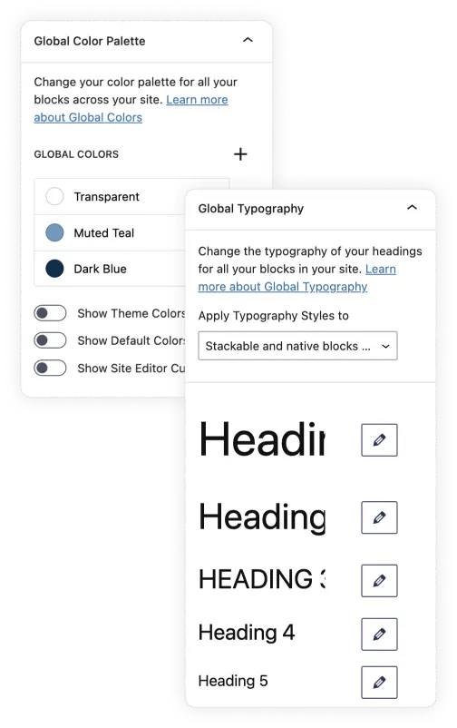
    Achieve a professional, polished look with these preset font pairs, allowing you to apply complementary typography combinations to your headings, body text, and button text effortlessly.

    You can also create your own font combination by clicking on the plus (+) sign. Set specific typography settings for each heading level and body text.

    Global Spacing & Borders: Precision Control Over Layouts

    This is a new addition to Stackable’s Global Design System. With Global Spacing & Borders, you can maintain structured, well-balanced designs by managing margins, paddings and borders globally.

    This way, you can make effortless adjustments without manually adjusting each block one by one.

    Here, you can control the spacing, borders, and shadows for columns, backgrounds, containers, and images.

    Global Buttons & Icons

    Buttons and icons play a crucial role in UI/UX, and now you can ensure they always match your design system. Another addition to the Stackable Design System is the Global Buttons & Icons.

    With this, you can easily define the sizing, borders, and shadows of your buttons, icons, and icon lists.

    How this Transforms Your Web Design Workflow

    Previously, building websites on the WordPress Block Editor with Stackable meant adding blocks one by one, and designing each block and copy and pasting the styles to other blocks. Now, with the Global Design System, this means you get to customize all blocks from one single panel.

    From adding blocks or wireframes, you can move to the Global Design System to set your colors, typography, and spacing then add your content from there.

    Experience the Future of Web Design Today

    The Stackable Global Design System is now available in the latest Stackable update. This feature is available for free, with a few more presets and options available only for premium users.

    Take control of your site’s design like never before and build websites faster, smarter, and more efficiently. Update to the latest version of Stackable now and transform your workflow with the new Global Design System!

    Go to source

  • New in Stackable: Icon Library & Granular Plugin Settings

    We’re thrilled to announce the latest Stackable update, bringing you two powerful features that enhance customization and usability: the Icon Library and Granular Plugin Settings.

    Let’s dive into what’s new and how these updates can elevate your web design experience.

    Icon Library: Save, Reuse, and Customize Your Icons

    Icons play a vital role in making your designs visually appealing and user-friendly. With the new Icon Library, managing your custom icons has never been easier.

    Here’s what you can do with the Icon Library:

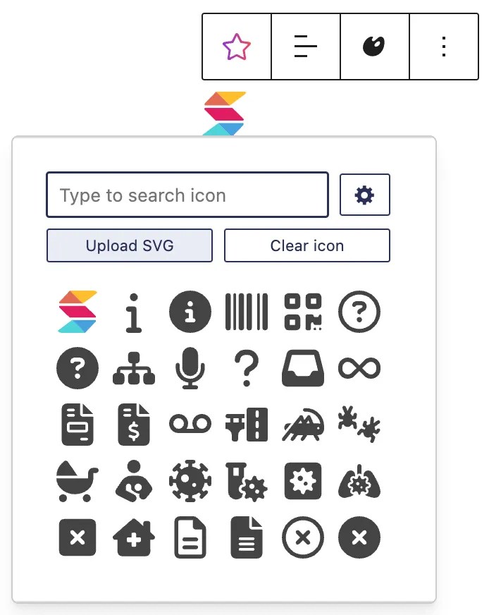
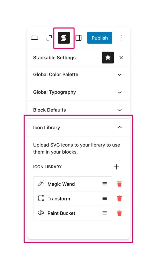
    Save Uploaded SVGs: Once you upload your SVG icons, you can save them to the Icon Library for future reuse.

    Streamlined Icon Picker: Saved icons will appear first in the icon picker, making them easy to find.

    Rename and Update Icons: Assign custom names to your icons, update them with new files, and keep everything organized.

    Search by Name: Quickly locate specific icons in the picker by searching for their assigned names.

    This feature is perfect for maintaining branding consistency across your projects, saving time and effort in the process. You will find the Icon Library in the Stackable settings in the Block Editor.

    Granular Plugin Settings: Full Control, Your Way

    We’ve completely overhauled the Settings menu to give you more flexibility and control over how Stackable works. Say goodbye to the old cluttered settings page! With the new tabbed and organized settings, you can now navigate and customize your experience using Stackable with ease.

    Right off the bat, when you access the Stackable settings page, you will see that it is now divided into these tabs: Editor Settings, Responsiveness, Blocks, Optimization, Global Settings, Role Manager, Custom Fields, Integration, Miscellaneous

    Each tab focuses on specific features, making it easier to find what you’re looking for.

    New and Improved Settings

    With the new interface comes a new range of updated settings that allow you to fully customize your user experience with Stackable.

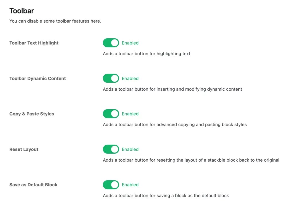
    Toolbar Settings

    Now you can customize the various toolbar buttons that come with Stackable. This is especially helpful if you find that you do not use some of the Stackable toolbar buttons, you can enable or disable buttons that Stackable adds to the toolbar, tailoring the editor interface to your workflow and keeping it as streamlined as you prefer.

    Enable/Disable/Hide Blocks

    Previously, you could only enable or disable blocks. Now, you can enable, hide or disable blocks completely.

    Here’s what each block state does:

    • Enabled – The block is available in the Block Editor as it would normally.
    • Hidden – The block is hidden from the block inserter. However, if you have this block already in the page, then you can still edit / use it.
    • Disabled – The block is not registered in the Block Editor. If you have this block in a page, and edit it, it will show up as an “unsupported” block.

    We have “Smart Disabling” built-in our blocks, this means that when you use designs from our Design Library or block variations that use a disabled block, they are automatically substituted with relevant core blocks. This way, disabling a block will still let you use other Stackable features.

    Some Stackable blocks need to use other blocks for them to work correctly. For example, the Accordion block uses the Icon Block for it’s toggle arrow (well it does some other things more behind the scenes) – so when you disable the Icon Block, the Accordion block would not function correctly anymore. In essence, the Accordion block requires the Icon block to be enabled, and the new settings inform you of this.

    Search Settings

    Navigating the settings just got simpler! Use the new search bar to quickly locate a setting. The relevant tab will highlight and other unrelated options will become hidden, guiding you directly to the option you’re looking for!

    Turn Off Stackable Settings

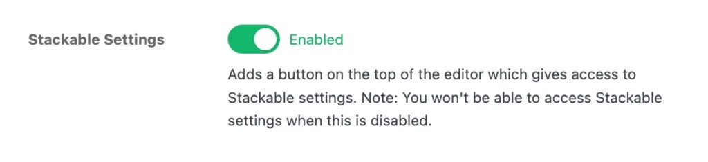
    For users who do not use global settings or prefer minimizing their editor interface, you can now turn off Stackable settings entirely. However, please note that turning this off will disable access to the global settings, so you won’t be able to make changes to them while this option is enabled.

    Why These Updates Matter

    These new features are designed to give you greater control, efficiency, and customization. Whether you’re building a personal project or managing a large-scale site, the updates ensure that Stackable adapts to your workflow and preferences.

    The Icon Library streamlines the creative process, while the Granular Plugin Settings give you full control and flexibility when it comes to managing plugin functionality.

    Try It Out Today!

    Update your Stackable plugin to explore these new features. We’re excited to see how they enhance your web design process! If you have feedback or suggestions, feel free to reach out—we’d love to hear from you.

    Stay tuned for more updates as we continue to improve Stackable and empower your creative potential!

    Go to source

  • How to Create Stunning Blog Page Designs on WordPress

    With millions of blogs competing for page views, your blog in WordPress needs to stand out not only through quality content but also through design and engaging user experience.

    The design of your blog plays a critical role in how your content is perceived by your website visitors, from the choice of typography and background colors to the layout and overall visual hierarchy.

    In this guide, we will cover topics such as the selection of the right WordPress theme, the utilization of page builders like Stackable right within the WP Block Editor, and most importantly, how you can easily create your own WordPress blog page design.

    By the end of this article, you will be equipped with the knowledge and tips on how to create a WordPress blog that is not only appealing but also optimized for success.

    Benefits of a Well-Designed Blog

    A well-designed blog page offers numerous benefits that can significantly enhance your online presence and audience engagement. Here are some key advantages:

    Improved User Retention

    A cluttered or poorly designed blog can be overwhelming and lead to high bounce rates. On the other hand, a clean and organized layout with clear navigation makes it easier for readers to find and consume your content.

    Having an aesthetic and user-friendly blog design can help retain your existing audience and encourage repeat visits. Additionally, incorporating elements like images, videos, and interactive content can break up long text and improve the overall user experience.

    Enhanced Brand Image

    A WordPress blog design should reflect your brand identity, and a well-crafted layout can significantly elevate your brand’s perception.

    A great blog design can help your content stand out, increasing the likelihood of shares and maybe, attracting new readers to your site. Plus, consistent branding elements, such as color schemes, typography, and imagery, can reinforce your brand’s recognition and create a lasting impression on your audience.

    Finding the Perfect WordPress Theme

    Choosing the perfect WordPress theme for your blog is a crucial step. It’s the foundation of your website that will significantly impact its overall design and functionality.

    With thousands of themes available, both free and paid, the process can be daunting. However, by considering your specific needs and preferences, you can narrow down your options and find a theme that’s perfect for your blog.

    Exploring WordPress Themes

    One of the best places to start your search for the perfect WordPress theme is by exploring theme marketplaces. These platforms offer a vast collection of themes with advanced features and customization capabilities. Some popular theme marketplaces include:

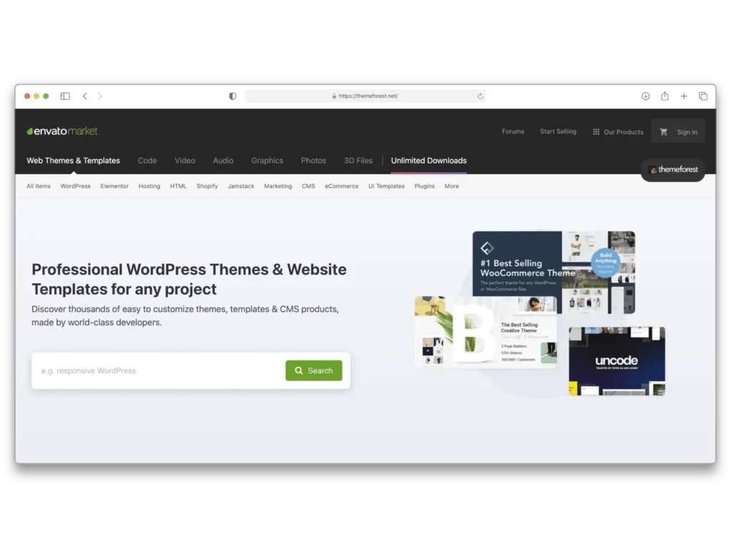
    ThemeForest (https://themeforest.net/): This marketplace boasts a wide range of premium WordPress themes, often featuring live previews and user reviews.

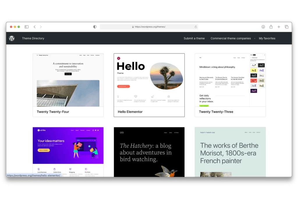
    WordPress.org (https://wordpress.org/themes/): The official WordPress theme directory offers a vast collection of free or freemium themes, many of which are highly rated and regularly updated by the WordPress community.

    Core WordPress releases themes every year that are built-in to your WordPress website. One great free theme is the Twenty Twenty-Four theme, which sports a modern and minimalistic design. It’s highly customizable in the WordPress Site Editor and it includes block patterns that you can easily insert into your page with just a click.

    If you have the budget for it, Premium themes can be an excellent choice for bloggers that are seeking for more features. Premium themes typically offer more advanced customization options, a wider range of layouts, and even provide online support if you encounter any issues.

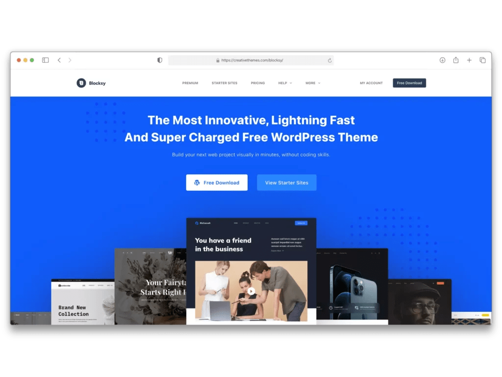
    One pre-made theme you could consider is Blocksy, which was designed to work seamlessly with the WordPress Block Editor. It has both a free and a premium version. The free version already includes extensive customizations and starter site templates that could get you started building your website in no time. You can find it right within the WordPress theme directory.

    Regardless of the theme that you select for your blog, the key is to select a design that resonates with your brand’s personality and provides an optimal user experience for your audience.

    Using Page Builders

    Page builders are tools that allow you to create custom page layouts and designs using a visual interface, without the need for extensive coding knowledge.

    WordPress comes with a built-in page builder called the Block Editor, which enables you to create pages by combining various blocks, such as text, images, galleries, and more. However, as of writing, it still lacks additional customization options that you might need to design your blog. This is where third-party page builders come in.

    One popular page builder for WordPress is Stackable, a free plugin that provides highly customizable blocks to help you create stunning blog page designs. Stackable is designed with a user-friendly interface that works within the WordPress block editor. It offers pre-designed templates called UI Kits, and features that make it an excellent choice for bloggers and website owners who want to create aesthetic blog pages.

    Discover a Whole New Experience of Web Design

    No matter who you are, blogger, entrepreneur, designer, developer, we guarantee you’ll want Stackable.

    SEE PRICING
    TRY PREMIUM DEMO

    Best Practices

    When using page builders, it’s essential to follow best practices to ensure your blog page design is visually appealing, user-friendly and optimized for performance. Here are some tips to keep in mind:

    Simplicity and Consistency

    While page builders offer a plethora of design options, it’s important to maintain a simple and consistent layout throughout your blog. Avoid overwhelming your visitors with too many elements or conflicting styles. Consistency in typography, color schemes, and layout can enhance the overall user experience and reinforce your brand identity.

    Stackable’s Global Colors and Typography makes this easy for you. You can define a consistent set of colors and typography setting that can be applied across all blocks on a website, ensuring a cohesive design while simplifying the process of site-wide styling.

    Mobile Responsiveness

    Ensure that your blog page design is mobile-responsive because your audience may access your content from various devices, including smartphones and tablets. The WordPress Block Editor includes live previews for mobile and tablet but lack the capabilities to exactly control or customize website elements for different devices. This is where page builders can also come in handy with additional responsiveness settings.

    Performance Optimization

    Excessive use of large images, animations, or resource-intensive elements can slow down your site’s loading times. Optimize your images and minimize the use of unnecessary elements to maintain optimal site performance. You should also be mindful of how a page builder impacts your blog’s performance. So be sure to select one that does not add any bloat to your website.

    Accessibility

    Design your blog page so that it’s accessible to users with disabilities or special needs. This includes incorporating alt text for images, ensuring color contrast, and providing alternative navigation methods for users who rely on keyboard navigation or screen readers.

    User-Centric Design

    Ultimately, your blog page design should prioritize the needs and preferences of your target audience. Conduct user research, analyze user behavior data, and gather feedback to understand how your visitors interact with your blog. This information can help you make informed design decisions that enhance the overall user experience on your website.

    Customizing Your Blog’s Appearance

    Customizing the appearance of your WordPress blog is crucial for creating a visually appealing and engaging experience for your readers.

    Choosing the Font and Colors of Your WordPress Blog

    The fonts and colors you use will shape the overall aesthetic and readability of your blog.

    Google Fonts offers a library of open-source fonts and icons that you can use for free. You can easily add it to your WordPress website by adding it manually, embedding it to your website, or downloading a plugin.

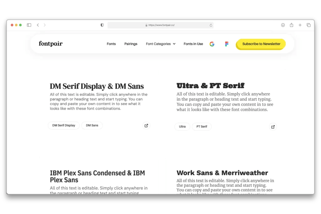
    If you’re having a hard time selecting a font, a great tool you can check out is Fontpair which curates Google Font combinations.

    When it comes to colors, create a palette of colors that not only enhances your blog’s aesthetic but also ensures readability and accessibility. Tools like Color Magic AI can help you generate stunning color combos based on a prompt you provide, and Coolors allows you to browse trending color palettes to find the perfect scheme for your blog.

    If you already have branding colors, use them consistently. Additionally, make sure to use high-contrast colors to make your content readable. You can use tools like the WebAIM Color Contrast Checker to see if your text remains legible, even for users with visual impairments.

    Select the Perfect Layout for Your WordPress Blog

    The key to an effective layout is to prioritize the user. How do you want the user to consume your content? How do you want to engage with your audience? These are some questions you should ask yourself in choosing your blog’s layout.

    Here are some common layouts you may consider:

    Classic

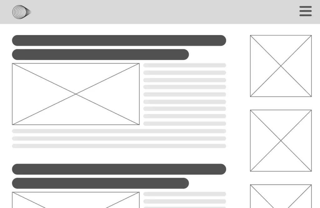
    A single column layout that displays your blog posts in reverse chronological order. This makes your most recent post the first one they encounter. This typically includes a sidebar alongside your main content. It’s a great option if you want your website visitors to have a peek at the contents of your posts.

    Grid

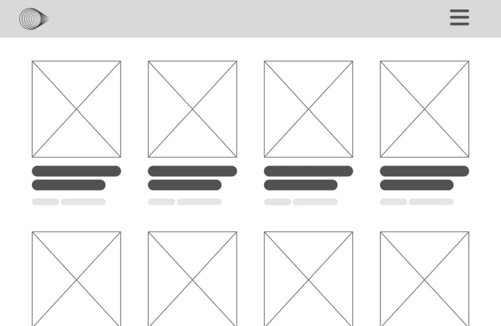
    A grid layout arranges your posts in a grid format typically accompanied with the featured image. This layout makes it easy for your audience to navigate through the articles you have on your website.

    Masonry

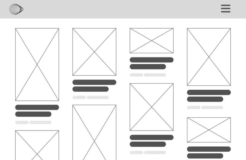
    A similar layout to the grid, but it stacks the posts like bricks on top of each other. If your blog is heavy on visual content, then this might be a great option.

    Carousel

    This showcases your blog posts in a horizontal layout that your audience can scroll through. It can scroll automatically so that the website visitors can see what content you offer on your blog.

    When you finally select your layout, it’s essential to strike a balance between providing ample information and avoiding clutter. Overcrowding with too many ads, or a jammed sidebar can overwhelm visitors and distract them from your primary content. Instead, carefully select the elements you want to add that will complement your main content and provide relevant, value-adding information.

    Optimizing for Different Devices

    Responsive web design is crucial for providing an optimal browsing experience across various devices. It’s not enough to design your website for desktop anymore, you must ensure your blog page looks great and functions seamlessly regardless of the screen size or resolution.

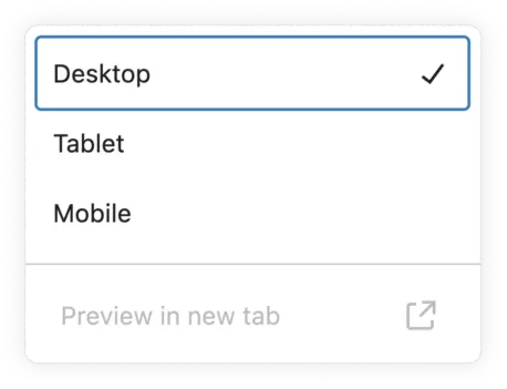
    Typically, there are three main screen types: desktop, tablet, and mobile. Your blog should maintain a consistent layout on each of these screen sizes. To achieve this, you can follow the principles of responsive design, which were first introduced by Ethan Marcotte in a 2010 post on A List Apart.

    The goal of responsive design is to offer every user, irrespective of their device, a consistent browsing experience.

    Responsive Designs

    To ensure your WordPress blog is mobile-responsive, you can make use of the built-in WordPress live previews in the Block Editor. This tool allows you to view your site’s design across different screen sizes, including desktop, tablet, and mobile in real-time.

    Responsive web design also utilizes CSS units that are relative like EM and REM for fonts; VH, VM, or % for other elements such as images or icons. By default, the Block Editor uses pixels, but you can change this to relative units within the settings to ensure your design scales beautifully across all devices.

    Page builders usually offer additional responsiveness settings that provide granular control to set different values for block elements based on screen size.

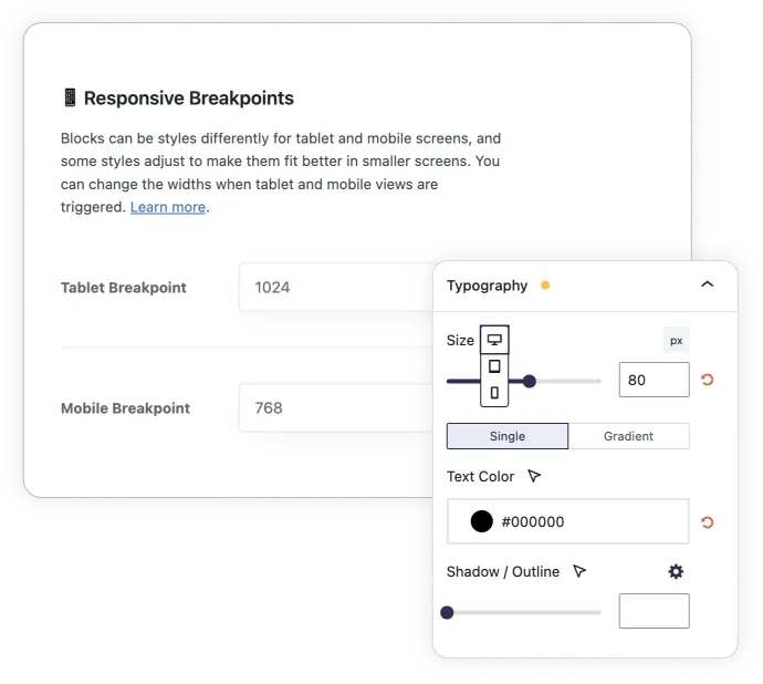
    Stackable, in particular, also offers the ability to hide or show blocks on desktop, tablet or mobile. You can also adjust responsive breakpoints. to set when your design should adjust to a different layout.

    Testing Across Devices

    While the WordPress block editor provides a convenient way to test responsiveness, you should still test your site across different browsers, operating systems, and devices.

    There are various online tools and emulators available that can streamline this process if you don’t have access to multiple physical devices. Some popular options include:

    • Google Lighthouse: Google’s own tool built-in to Chrome to assess your site’s mobile-friendliness
    • MobileTest.me: Tests your site across six popular mobile device emulators, including iPhone 5, HTC ONE, and Google Nexus.
    • Am I Responsive: Enter the test URL to see results for generic devices. Click inside each screen to scroll and interact with the site.

    Additional Resources and Tools

    Here are some useful plugins and design resources to consider when creating a stunning blog page design on WordPress:

    Useful Plugins

    1. WPForms: A user-friendly form builder plugin with pre-built templates, conditional logic, and integrations with popular services like PayPal, Stripe, and HubSpot. You can use this to create contact forms, collect email newsletter subscribers, and more.
    2. Imagify: An image optimization plugin that compresses and optimizes your images, reducing file sizes while maintaining quality.
    3. RankMath : A plugin that you can use to optimize your content for search engine rankings.

    External Design Resources

    1. Heikei: A website that offers stunning backgrounds and visuals for your blog or website.
    2. Designspiration: A platform where you can save and explore inspiring designs to fuel your creativity.
    3. Shots: A website that provides easy mockups for products and thumbnails, useful for showcasing your blog or website design.
    4. Pexels: A library that offers high quality and royalty-free stock photos and videos.

    These resources are at your disposal so you can streamline your design process for your WordPress blog.

    Conclusion

    In this article, we’ve explored different tips, tools, and resources you can use to create a stunning WordPress blog page design. This includes selecting the right theme, utilizing page builders, optimizing layouts for responsiveness, and using essential design elements like fonts, colors, and responsive layouts.

    Now it’s up to you to find that sweet spot between reflecting your brand’s identity and creating a design that resonates with your target audience.

    Go to source

  • Improved Stackable Server Performance

    Our team has been hard at work on Stackable’s latest update. In this article, we break down how Stackable V3.13.0 optimized Stackable’s speed and performance PLUS other enhancements we’ve added to the plugin.

    Stackable PHP Execution Times Now Up To 2x-3x Faster

    V3.13.0 brings you the fastest Stackable yet. In this update, we have focused on significantly enhancing the server performance of Stackable, and we have seen up to 2x to 3x plugin code execution speed improvements!

    All websites made with Stackable will benefit from this, however, the performance update is expected to be felt significantly more by those hosted on shared hosting or affordable hosting platforms, where resources are limited. By optimizing the efficiency of Stackable, this update helps to significantly reduce the load on shared servers. This gives websites faster response times both in the WordPress backend and frontend for a smoother overall user experience!

    To help you visualize the improvements in Stackable, here are some speed benchmarks we made. For this, we used Code Profiler, which is a plugin that measures the PHP execution times of the plugins and themes present in a website. All tests were done on the free versions of all plugins. The names in the benchmarks are hidden since they’re not important, it’s the relative measurements that we care more about.

    Benchmark #1: Stackable Before & After Update

    So how much did Stackable’s execution times improve? We benchmarked the before and after the performance update of Stackable across different website and server environments and here are the results:

    We tested Stackable v3.12.15 and v3.13.0 PHP execution times in the homepage in different website & server environments. Run 1: Results from our internal testing website hosted in InstaWP. Run 2: Results from our Staging site hosted in Kinsta. Run 3 & Run 4: Results from different local development environments with Local by Flywheel. Run 5: Results from a Stackable user’s live shared hosting site.

    Based on the above, it’s clear that there is a huge performance increase! You’ll also see though that the amount of improvement is different per server environment. Run 2 didn’t see much of a difference as our setup there is already fast.. but run 5 which was from an actual live website removed 2 whole seconds off!

    Benchmark #2: Before & After in a website

    Next up, how does Stackable’s performance improvement look like in an actual fully functioning website?

    We benchmarked our staging website to find out how much Stackable has improved, we kept all the plugins we’re using active – these range from security plugins, performance plugins to utility plugins. Here are the results:

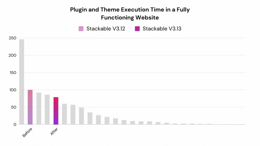
    This is the benchmark of our actual staging site with all the plugins we currently use. Each bar is the execution time of a plugin in the site. We then ran Code Profiler on that site’s frontend, the above is the average of 5 runs.

    Our site already is performant off the bat, so the improvement that we see in terms of milliseconds shaved off is minimal. However, a small amount of improvement goes a long way if you have thousands of visitors that go to your site!

    Benchmark #3: Stackable & other block libraries

    So far so good, but we were also thinking: how does Stackable’s performance improvement stack up against other block libraries? We got some of the top block library plugins that have similar offerings of blocks and functionality and did a comparison. Here are the results:

    We got a test website and installed different block libraries in it, and created a sample page that contained a text block (or similar) from each block library. We then ran Code Profiler on that page’s frontend, the above is the average of 5 runs.

    Benchmark #4: Stackable & page builders

    Now for a bit of apples to oranges comparison, we were curious on how Stackable goes against the top page builder plugins. We thought we might throw this into the mix since the Block Editor alongside Stackable is quite a capable alternative to building full websites. Here are the results:

    We got a blank test website, and installed different page builder plugins in it along with Stackable. Then ran Code Profiler on the home page, the above is the average of 5 runs. Note that the home page wasn’t built using any of these plugins.

    Benchmark Results

    As we mentioned earlier, the results seem to be more significant if your site is using shared resources. But nevertheless, you may be able to see x2 to x3 code execution improvements with Stackable. This can improve website performance, not just in terms of speed but this will lead to a smoother user experience for you and your website visitors!

    You can also test this yourself and see how Stackable’s performance has improved in your own websites. Results will vary depending on the website, hosting, and other active plugins. You can find Code Profiler in the WordPress Plugin Directory!

    If you’re curious on what exactly we did to achieve this, we meticulously went through a lot of the internals of Stackable and optimized the following:

    • Database queries: We refined some long running database queries to make them faster
    • Various functions: We have fine-tuned the functions within Stackable to run more efficiently
    • Post handling: We’ve refactored how Stackable queries and deals with posts
    • Block registration: The way Stackable loads blocks has been optimized, minimizing disk reads
    • Option autoloading: We’ve removed autoload options so that they will only be loaded when needed

    Prepare to experience the fastest, most efficient website building yet! Update to the latest version of Stackable and see the difference yourself.

    Other Stackable Feature Updates

    We have released a number of bug fix and feature updates since our last major feature update (V3.12) and we’d like to take this time to let you know about some of the significant updates we’ve introduced.

    A lot of people have been asking for the Carousel block to have the option to infinitely scroll. In V3.12.12, we added the Infinite Scroll option in response to that. You will find it in the Layout panel of the Carousel block.

    This new setting allows for endless scrolling of content, making it perfect for showcasing numerous slides seamlessly. See it in action:

    Feature Update 2: Icon List Block Revamp

    Our Icon List block has undergone a comprehensive revamp to address user feedback regarding the difficulty of aligning and sizing icons.

    In our revamped Icon List block, we’ve introduced enhanced alignment options to give you more control over the appearance of your lists.

    Here’s a breakdown of how these alignment options work:

    • List Item Alignment: This option applies to each individual list item within the list. If “Right” is selected, for instance, each item will align to the right within the list.
    • List Alignment: This option is available when the “Full Width” toggle is turned off. It controls the alignment of the entire list within its container. Choosing “Center” will center the whole list horizontally on your page.

    Additionally, the Icon Vertical Alignment control adds another layer of customization. This adjusts the vertical position of the icons relative to the list item content. Whether aligned at the top, middle, or bottom, this setting positions the icons harmoniously with the Icon List block’s text.

    The Icon List block now comes with the option to have borders between each list item. These are available in styles such as solid, dashed, or dotted. Like all border controls within Stackable, you can customize the thickness (Border Width) and color (Border Color).

    Feature Update 3: Columns Can Now Wrap in Desktop

    Previously, the Columns block only supported wrapping in mobile and tablet views. Recognizing the need for more versatile design options, we have extended this functionality to desktop views as well!

    Users can access the “Allow Column Wrapping” toggle in the layout panel. When enabled, additional controls will appear beneath the toggle, providing the option to adjust the width of each column individually.

    This ensures that users can precisely tailor the column layout to meet specific design needs and preferences.

    Feature Update 4: Color Picker Opacity and Gradient Picker

    Our updated gradient color picker now features multiple color stops and customizable angles, enhancing design flexibility. This tool is available in most Stackable settings involving color, allowing users to create intricate and dynamic color gradients that perfectly match their site’s aesthetic.

    Additionally, the color opacity control was moved inside the color picker. This makes for a more efficient design workflow since all color settings are now located in one place.

    Other Notable Feature Updates

    The 4 above are the most asked for features that we’ve released, but here are the other features that we have been able to push out:

    • Dynamic Content post search improvements
      • While picking which post to display dynamic content from, searching by post ID is now better handled, and more search matches will now appear in the post picker.
    • WooCommerce Product Description new option
      • We added the option to disable stripping of HTML tags in the Product Description field if you need to preserve any HTML formatting when displaying them.
    • Images and background images can now be inputted via URL
      • Now you are not forced to use an image from your Image Library for image blocks and background images, you can use any URL.
    • Accordion Block
      • We’ve upgraded the Accordion block with improved schema to enhance its functionality as a Q&A section. This feature addition was highly requested by users. When a group of accordions is used as an FAQ section, this will make it easier for search engines to recognize it as so.
      • You can now assign anchor links to Accordion blocks. This allows for direct navigation to the accordion and its automatic opening. This streamlines user experience and access to information.
    • Better Border Controls
      • Border customization has been refined, with options to adjust each corner’s radius individually. The border color picker also now includes an opacity slider, giving you more precise control over the border effects.

    Conclusion

    This update not only boosts the speed and performance of Stackable blocks but it also brings a host of new features and improvements.

    From the infinite scrolling of the Carousel block to the more flexible and aesthetically pleasing Icon List block. Every feature has been designed to make your web building experience with Stackable more intuitive and enjoyable.

    Update to the latest version today and unlock these powerful new capabilities to create stunning, efficient websites!

    Go to source

  • A Step-by-Step Guide to Creating Countdown Timers that Convert

    Countdown timers create a sense of urgency, making them a key tool in digital marketing strategies. The Stackable plugin adds functionality and ease to WordPress sites, offering diverse blocks for various needs.

    Creating urgency and a sense of scarcity encourages customers to make decisions quickly, preventing missed opportunities.

    We often see this used as a sales tactic called “Scarcity Marketing”. An example would be when a business holds a sale for a limited time of 3 days. Another would be offering limited edition products in small quantities, garnering a sense of exclusivity.

    This tactic leverages the principle that people are more likely to purchase something more readily if they believe it is in scarce supply or available only for a limited time. This approach taps into the fear of missing out (FOMO) concept and can be highly effective in boosting sales.

    In the world of web design, we can also apply this tactic and boost conversion. But how? How exactly can you create a sense of urgency on a website? One of the easiest and most common ways is to implement a countdown timer.

    By using countdown timers, marketers can significantly enhance user engagement and increase the likelihood of conversions on a website. In this article, we’ll walk you through how you can create an effective countdown timer.

    Step-by-Step Guide to Creating an Effective Countdown Timer

    If you want to add a countdown timer by yourself, you will find that there are many different ways to do it. A route you can go for is to code it with HTML, CSS and Javascript. However, if you have little to no knowledge in coding, this might prove difficult.

    In this tutorial, we’ll create a countdown timer using Stackable. Stackable offers a powerful set of tools and features that can significantly enhance the creation of websites. Stackable provides pre-made blocks built to work with the WordPress Block Editor. This includes the Countdown block, which allows for extensive customization. It’s the perfect tool to set you up for success!

    Step 1: Installing and Activating Stackable

    Begin by installing and activating the Stackable plugin on your WordPress site. You can find the Stackable plugin for free on the WordPress block directory.

    A screenshot of Stackable in the WordPress plugin library

    Step 2: Define the Purpose

    Determine what you are counting down to. Is it a sale, product launch, event, or something else? With this, you then have to decide what you want to achieve with the countdown timer, such as increasing sales, boosting event attendance or creating buzz around a product launch.

    As an example, here we have a website for a hypothetical productivity app created using Stackable blocks:

    A screenshot of a website of a hypothetical productivity app

    In this example, it doesn’t exactly create the sense of urgency we want to impose on the website visitor. The website visitor wouldn’t exactly know until when the sale will be held either.

    Here, we’ll be counting down to the end of a sale and the goal is to increase sales.

    Step 3: Determine Prominent Placement

    You have to strategically position the timer in a visible spot on your website. Common places are on the homepage hero, a sticky banner on the top or bottom of the page, and in some cases, a pop up banner that appears as a user scrolls on the page.

    Let’s add the Countdown block on the hero, right beside the pricing.

    Step 4: Configure the Countdown Timer

    Choose the target end date and time for your countdown. With the Countdown block selected, go to Style tab > General panel and input the date and time when this countdown will end.

    You can manually select the Timezone with Stackable’s Countdown block. You may select a specific timezone or select Local Timezone. Local Timezone means that the Countdown block adapts to the timezone of the website visitor. However, we want to keep this number uniform for all users across different timezones. Let’s select the New York (Eastern) option in the Timezone setting.

    In the General tab, you will find other settings such as the Action on Expiration .

    Now, in the Action on Expiration option, you have three options to choose from: None, Hide Block, or Display Message Upon Expiration. Let’s select Display Message Upon Expiration so that the website visitor would at least be informed that the sale has ended.

    You will then find a new panel in the Style tab called “Expired Message”. This is where you can input the text that will appear once the countdown has finished.

    In the Content field, write the text that you want to appear once the countdown is done. Here, we put “You just missed it! Sale has ended ?

    Step 5: Impose Urgency and Relevance

    The message accompanying the timer should create a sense of urgency but must also be relevant to the audience. You could use phrases like “Offer ends soon!” or “Available only for a limited time!”. These phrases can motivate users to act quickly.

    Here are some other examples of slogans you can use to impose that urgency and relevance:

    • Sale ends soon
    • Hurry!
    • more

    In our example, we changed the accompanying message to: “Sale ends in”

    Step 6: Customize the Countdown Timer

    Stackable blocks automatically adopt the Typography of your website’s theme. If you want to further customize the blocks, you can do so with Stackable’s extensive settings and controls. This is where you can apply your website’s branding and aesthetic to catch the eye of your website visitors.

    Here, we just changed the Text Color of the Digits, and adjusted some of the typography, such as the Font Weight and Font Transform.

    Step 7: Add a Call to Action

    Strategically place a clear and compelling call to action near the countdown timer to enhance its effectiveness. This is what will ultimately help you achieve your goal.

    The CTA will reinforce the message of urgency or the importance of completing the desired action immediately. More than that, we streamline the decision-making process for the user. Instead of scrolling further down the page, we give them the opportunity to take the next step right then and there.

    Here are some examples of CTAs you could use in conjunction with a countdown timer:

    For E-commerce and Sales Campaigns

    • Shop Now – Sale Ends Soon!
    • Claim your discount now

    For Event Registration

    • Register now. Spots are limited!
    • Sign up before it’s too late
    • Reserve your seat today

    For Product Launches

    • Pre-order now to guarantee yours
    • Be the first to experience

    For Charity and Fundraising

    • Help us reach our goal now
    • Last few (time unit) to give

    How could we do this in our example? The button text in our homepage’s hero section is simply “Get it now!”. This doesn’t exactly enforce a sense of urgency so we can improve on that.

    We’ve changed the button text to: “Get it before it’s gone!”. This is an improvement from just the typical button text that we usually see.

    Step 7: Preview and Launch

    Now you’ve set up your countdown timer, it’s time to preview how it looks like in the frontend. You could also make sure to check if it works well across various browsers and devices.

    If it’s looking great, now it’s time to determine the best time to launch this countdown based on your website’s audience’s behavior. For example, if you’re launching the countdown for a sale, it might be best to wait until the afternoon. This is usually when people get off work and have more time to browse online.

    Once your countdown timer is live, you may want to monitor its initial performance. First, for any unexpected issues that might arise. This includes checking the website load times, functionality issues, or user experience problems.

    Second, for how well it’s performing against your goal. Again, if the goal is to boost conversions, we want to make sure our countdown timer is achieving that. You can utilize web analytics tools such as Google Analytics and Google Tag Manager to track users’ engagement with your countdown timer.

    Conclusion

    Creating urgency with countdown timers significantly boosts engagement and conversions. Using Stackable for WordPress, we’ve shown how to effectively set up and launch these timers. Countdown timers are a great tool to utilize in your marketing strategies, enhancing sales, registrations, or product launches. Proper placement and compelling calls to action are crucial. Embrace the power of urgency and transform site visitors into active customers. Follow the steps provided to achieve measurable success in your digital marketing efforts.

    Go to source

  • How to Install and Configure WordPress Classic Editor in 2023 + Best Usage Practices

    Since the release of WordPress 5.0, many websites have switched from the WordPress classic editor to the Gutenberg block editor. While blocks are a core part of the WordPress experience, some may prefer to use the classic editor to create and manage a website. Fortunately, there are several ways to install and configure it, and […]

    Read More…

    The post How to Install and Configure WordPress Classic Editor in 2023 + Best Usage Practices appeared first on Hostinger Tutorials.

    Go to source

  • WordPress 6.4 Font Library Feature Punted to 6.5 Release

    The WordPress 6.4 release squad has decided to punt the planned Font Library feature to 6.5 after core maintainers found major gaps in the Font APIs that cannot be resolved in time for the upcoming release.

    “I am currently reviewing the font APIs PR,” WordPress REST API co-maintainer Jonny Harris said. “I must say, I am very worried about the PR in its current state. The code simply doesn’t follow the WP core code style and doesn’t feel WordPress.” He listed a number of problems he found with the feature:

    • Limited developer API. We need functions like wp_insert_font / wp_create_font etc.
    • Lack of filter or actions
    • No way to unregister font collections
    • Capabilities. Creating new fonts should have capabilies and not simply map to edit_theme_options
    • Confusing API structure.  Collection should have embedded font objects
    • What happens to fonts when collections are unregistered?
    • If fonts are stored as post object, can I query to get all fonts from a collection?
    • Are fonts deleted when the user is deleted?
    • No way to filter where a font is stored

    “With time very limited in this release, it feels like actioning the above, feel like it is going too hard to achieve in this release,” Harris said.

    “I think this feature needs some more time to bake.”

    Harris said none of the REST API maintainers were involved in the early stages of the Font Library feature and they are currently “playing catch up.” The team was attempting to patch the existing design, but Harris said if a redesign of the API is planned, he would like to understand the requirements for the feature before drawing up a design.

    Punting a flagship feature is never an easy decision, but it’s far more preferable than shipping poorly designed API’s that don’t allow users to modify and disable the feature to fit their needs.

    “No is temporary but yes is forever,” WordPress core committer Aaron Jorbin said. “Once the code is merged into core for release, it’s something that needs to be maintained for our extenders forever. To me, the concerns I see being raised about how people will extend the feature are enough to punt the feature.”

    The Font Library feature was put forward late in the release cycle, landing in Gutenberg 16.7 last week, with very little time for testing.

    “Features have landed after beta 1 in the past,” WordPress core committer Jonathan Desrosiers said. “But my preference is to not land something with this much outstanding feedback. We’d be making last minute changes and merging for public release with very little actual testing. Sure, everyone here would test as best they can. But ‘in the wild’ WordPress testing is much different and always uncovers some strange use cases or issues that we can’t foresee.”

    Contributors briefly considered delaying the release date to allow the feature more time but the consensus was for punting to 6.5, with the decision anchored in WordPress’ philosophy of “deadlines are not arbitrary.”

    “Changing a scheduled release date to leave room for finalizing a feature—no matter its priority—should not be considered,” WordPress core committer Joe McGill said. “This would not be the first time that we really hoped to have a feature shipped in a release but delayed it to the next release. It seems to me that a lot of effort has gone into preparing this feature for release and the consensus is that folks need more time to get it into a state that is ready to ship in a major WordPress release, which I know is disappointing, but also speaks to the care and quality folks want to ensure we put into these releases. If it’s not ready, it’s not ready. Let’s delay it — meanwhile we are still getting valuable user feedback via the Gutenberg plugin, which is a good thing.”

    WordPress 6.4 release lead Josepha Haden Chomphosy made the difficult decision to punt the feature based on contributor feedback. The removal of the Font Library does not affect other key features anticipated to land in the release. Jessica Lyschik, 6.4 default theme co-lead, confirmed the Font Library isn’t a requirement for Twenty Twenty-Four. The theme will ship with preselected fonts that get loaded from the theme assets, just like previous default themes.

    WordPress 6.4 Beta 3 is scheduled for October 10, 2023. This will be the last scheduled beta before RC1.

    Go to source

  • This Month in WordPress: September Roundup

    September marked a shift in focus for the WordPress community. With major WordCamps wrapped up, all attention is now on WordPress 6.4 – the final significant release of 2023. The first beta version is out, giving us an early look at what to expect.

    As for Hostinger, we have released some exciting updates for our AI Assistant plugin to make your website more SEO-friendly and enhanced our WordPress Blog theme to give you more customization options. 

    Let’s dive into the WordPress news and updates for September. If you miss anything or have feedback for the community, complete the WordPress Annual Survey. 

    Hostinger WordPress Updates

    Let’s start by looking at the new features we have released for our WordPress products.

    Hostinger WordPress AI Assistant Updates

    We rolled out important updates to our WordPress AI Assistant plugin. The AI now generates SEO meta descriptions and keyword suggestions. These features are designed to boost your position in search engines and click-through rates. 

    You’ll see new sections in the AI Assistant panel where you can edit these generated suggestions.

    Keywords and meta description sections on Hostinger WordPress AI Assistant interface

    In addition, the AI Assistant is now available in nine languages:

    • French
    • Spanish
    • Arabic
    • Chinese
    • Indonesian
    • Lithuanian
    • Portuguese
    • Ukrainian
    • Turkish

    If your WordPress site uses one of these languages, the plugin’s interface will automatically follow the defined language. Here’s an example of the interface when we set the language to French.

    Hostinger WordPress AI Assistant interface in French

    Hostinger Blog Theme Font Selection

    We have also improved our WordPress Blog theme by adding a font selection feature during the onboarding process and in the theme settings on the WordPress dashboard. As a result, you will get more customization options for your design. 

    Font selection step on hPanel's WordPress onboarding when using Hostinger Blog theme

    WordPress Annual Survey 2023

    Each year, WordPress carries out a survey to gather feedback from users, developers, and contributors and identify key areas that need improvement. The survey helps the WordPress team understand users’ needs and select the direction to move the project forward.

    This means that every response is crucial for creating a better user experience and improving the platform.

    The survey is available in 10 languages you can choose on the site for your convenience. You can start filling out the survey by visiting the WordPress Annual Survey website.

    WordPress 6.4 Beta Version

    The first beta version of WordPress 6.4 was launched at the end of September, introducing plenty of workflow enhancements, as it backported six latest versions of Gutenberg – from 16.2 to 16.7 – into the core. The release date for this new version is November 7.

    We will write a detailed post about our beta testing to preview the new version. In the meantime, here’s a short glance:

    • Twenty Twenty-Four theme – the new versatile default theme caters to three use cases – blogs, portfolios, and businesses. This is an improvement from previous default themes that only focused on blogs.
    • Query Loop pagination improvement – WordPress won’t reload the page anymore when users switch between pages. There’s also an option to customize the amount of displayed pages.
    • Image block improvement – WordPress 6.4 adds aspect ratio settings to quickly change the dimension to suit your design. You can also enable the lightbox feature to enhance your user experience.
    • Group block improvement – enhanced with background support, it now adds a visual element to sections of a page or post.

    Hostinger Academy Podcast With WordPress Experts

    We’ve released two podcast episodes featuring interviews with WordPress experts Hari Shanker and Destiny Kanno, recorded during WordCamp US 2023.

    In our conversation with Hari, we discussed initiatives like Five for the Future and Contributor Mentorship, exploring their impact on the future of WordPress. 

    With Destiny, we delve into her involvement with the Learn WordPress platform and its evolution to guide new users, including introducing new learning pathways. 

    These insightful episodes are available on our Hostinger Academy YouTube channel. Alternatively, you can read the corresponding blog posts for Hari Shanker and Destiny Kanno.

    WooCommerce 8.2 and Updated PHP Version Requirement

    WooCommerce has rolled out the beta for its upcoming 8.2 version, set for release on October 10. A notable change is the PHP requirement, now elevated from 7.3 to 7.4. 

    This move aligns with current trends, as PHP 7.3 users are declining. Dropping support for older PHP versions also improves WooCommerce security and prepares for better compatibility with PHP 8.X versions.

    If your WooCommerce site is on PHP 7.3 or lower, it’s time to upgrade to 7.4. Use our staging environment and hPanel’s PHP configuration to make the transition seamless.

    What’s Coming in October

    Development for WordPress 6.4 is ongoing and might change before its November release. If you’re keen on testing the developmental version, use the Beta Tester plugin. Ensure you’re working on a secure test site or a staging environment.

    Stay tuned for our October roundup on the latest WordPress news and developments.

    The post This Month in WordPress: September Roundup appeared first on Hostinger Blog.

    Go to source